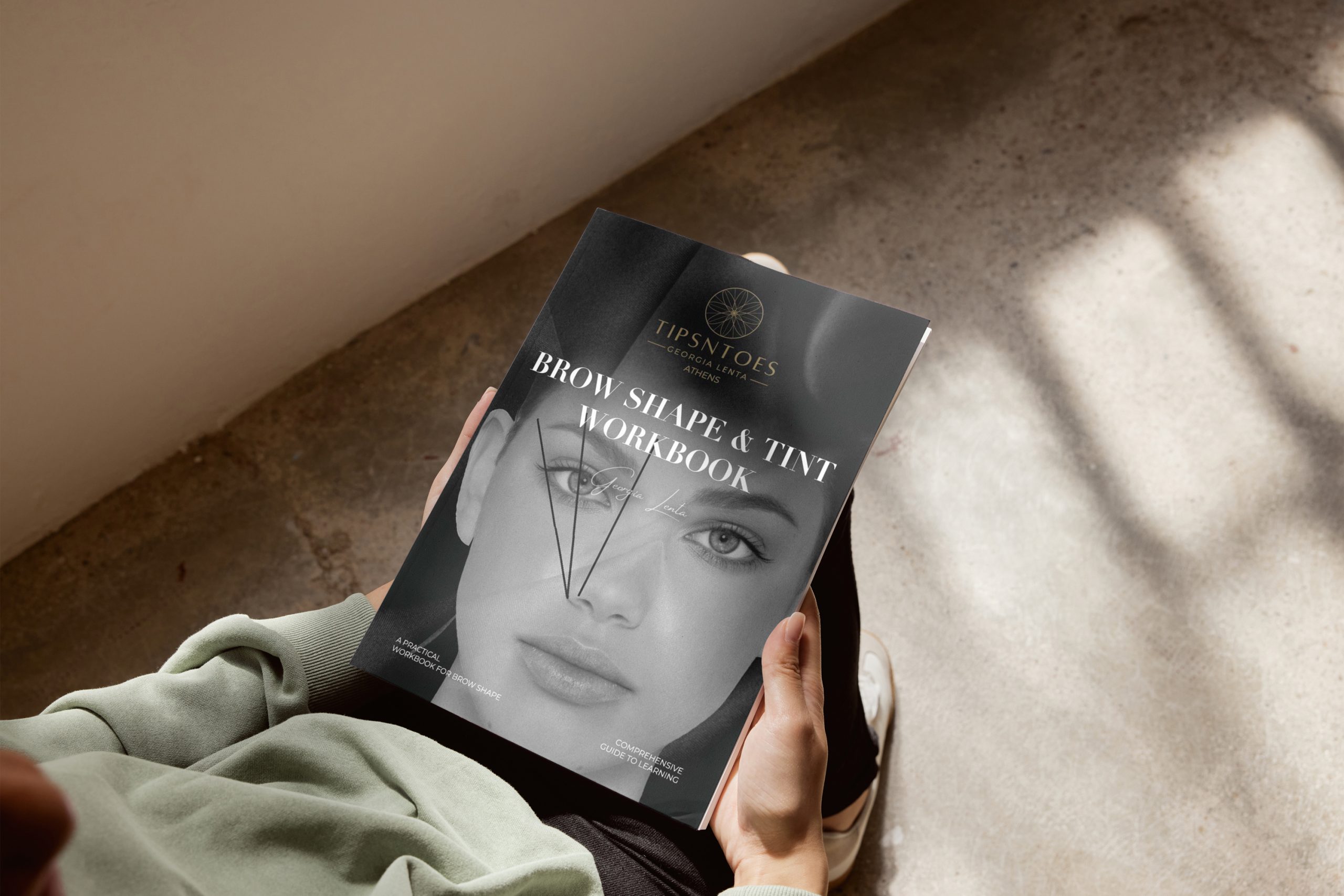
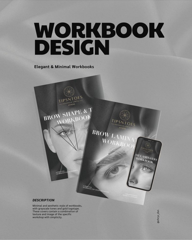
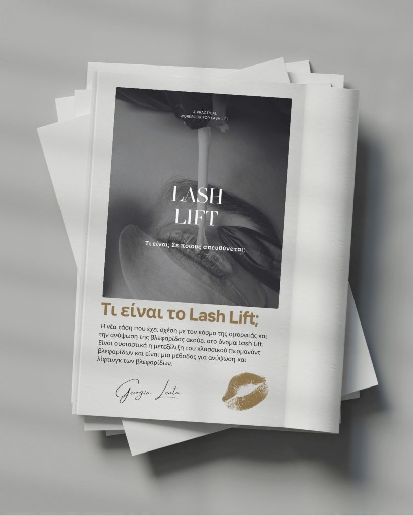
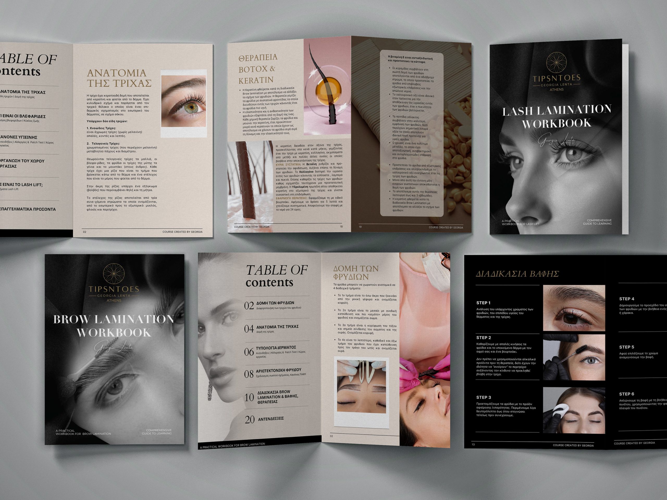
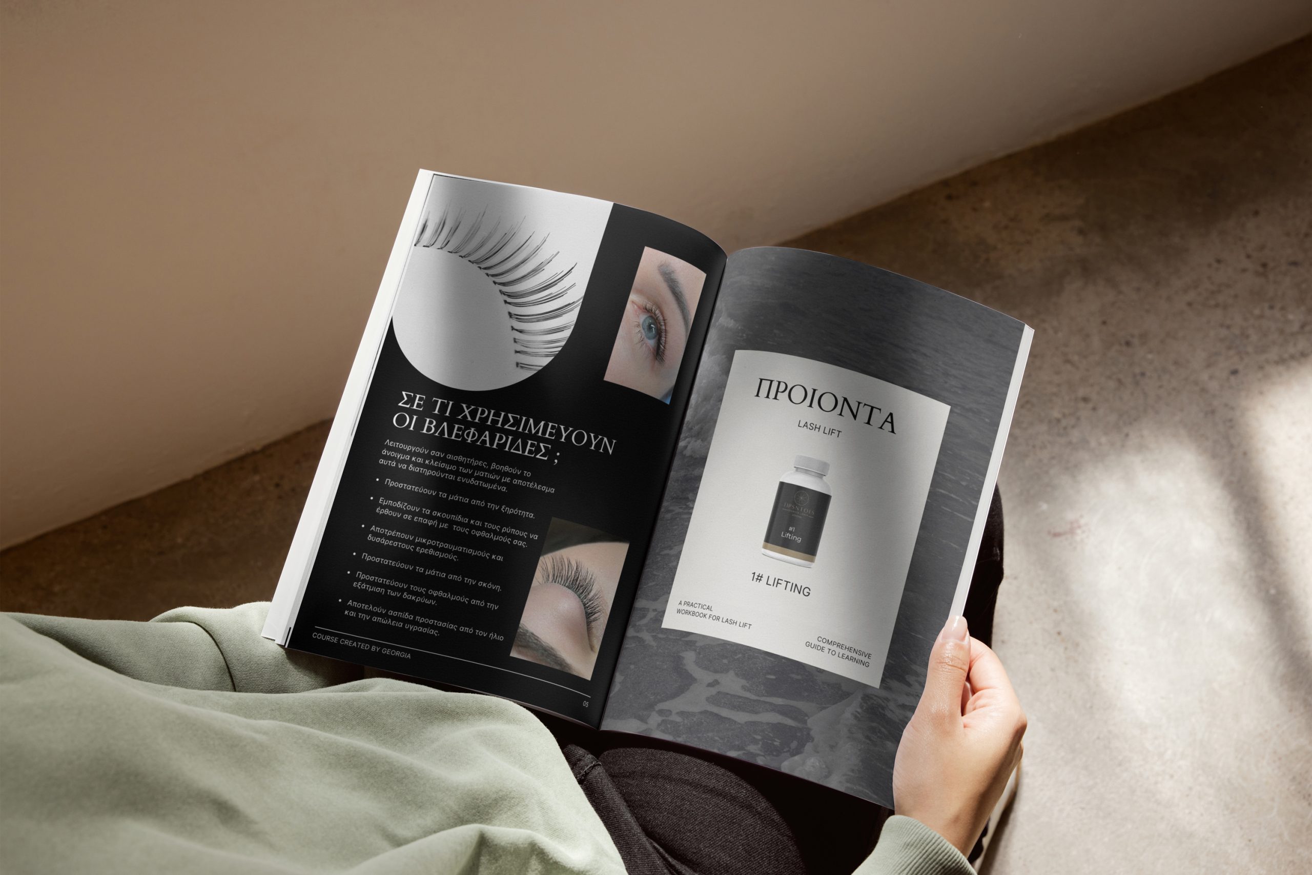
he TipsNToes booklets reflect elegance and simplicity while aligning with the brand’s focus on refined beauty services. The design uses a soothing grey color palette with soft beige accents. This minimalist approach feels modern yet timeless. The subtle tones create a calm, professional atmosphere and highlight the high-quality brow and lash treatments the brand offers.
Design and Style
The layout of each booklet enhances readability and visual flow. It allows the content to stand out without distractions. The minimalistic design highlights clean lines and generous white space. This approach presents every detail about brow lamination, lash lamination, and brow shaping with clarity and sophistication. Muted grey and beige tones create a cohesive look that feels understated yet luxurious. The design appeals to clients who value subtle beauty and expert care.
Purpose and Experience
Beyond aesthetics, these booklets guide clients through the processes and benefits of TipsNToes services. The design creates an inviting and informative experience. It reinforces the brand’s focus on enhancing natural beauty with precision and style. Through these booklets, TipsNToes communicates professionalism and trustworthiness. The visual identity reflects the same care and expertise found in its treatments.