
Close

Starbucks is one of the most recognizable brands in today’s world. With 52 years of history, the company has established itself to dominate the coffee industry with more than 35,000 stores worldwide.
Starbucks has shown that a well-established brand comes hand in hand with a great logo. This case study will examine the history of the Starbucks logo, its development, and its meaning to understand the company’s success better.
Founded in 1971 in Seattle by Jerry Baldwin, Zev Siegl, and Gordon Bowker, Starbucks started as a place where people could buy coffee beans, coffee-making equipment, and spices. These three friends wanted a friendly space for coffee lovers to meet and enjoy a nice cup of coffee.
In 1983, Howard Schultz, an employee of the Starbucks shop, discovered the espresso coffee while on a trip to Milan; this moment would revolutionize coffee in the United States.
When he returned to Seattle, he envisioned revolutionizing the American coffee industry by introducing espresso on Starbucks’ menu. He wanted to differentiate Starbucks’ coffee from the regular “cup of coffee” everyone asked for elsewhere. Schultz also wanted to create a ‘third space’ in peoples’ lives, somewhere aside from their homes and workplace to gather and frequent where they will form connections. He wanted Starbucks to be more than just a cafeteria; he wanted the chain to be part of people’s every day.
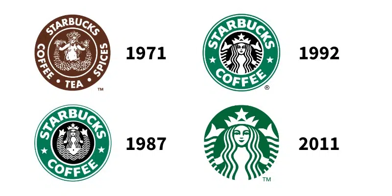
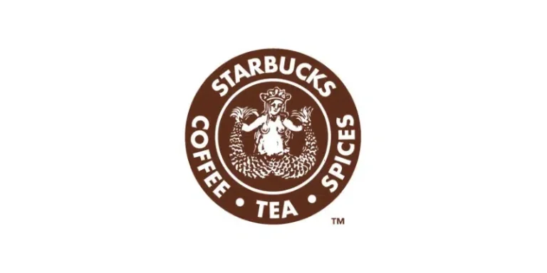
In 1971, Terry Heckler, a graphic designer hired by the founders, designed the company’s first logo.
Heckler got inspired by a 16th-century Norse woodcut of a mythical sea creature – a siren. The drawing represented a topless siren holding two tails in her hands.The symbolic green that is renowned today was nowhere to be seen on this first logo, as brown was the protagonist. In addition, the original logo included the words “coffee, tea, and spices”.
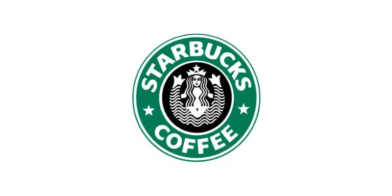
Starbucks underwent a significant rebranding effort during this period and updated its logo. The new logo still featured the siren, but she was now dressed and more conservatively depicted, with her nudity covered by her hair. In addition, the words “tea and spices” were removed due to the company’s focus on coffee sales.
However, the most significant change was the shift in the colors. 1987 saw the appearance of the infamous “Starbucks green”, a result of the merging of Starbucks and coffee company Il Giornale’s logos. This union also gave the two stars on each side of the logo.
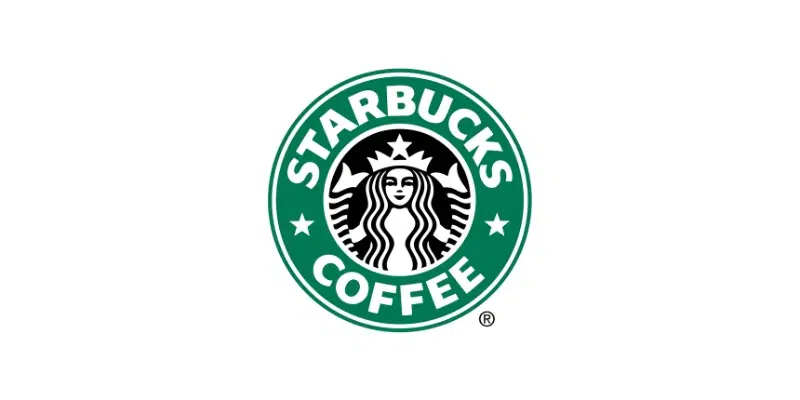
As mentioned earlier, the 1990s were the decade of Starbucks’ expansion; therefore, the company decided not to change much of the previous logo to keep its familiarity.
After a light redesign in 1992, Starbucks’ logo remained almost the same. The only significant difference was the new close-up of the siren; her whole body was no longer visible, with her torso covered by her hair.

In 2011, Starbucks underwent its most significant logo change to date.
The company removed all lettering from the logo and opted for a simple, stylized representation of its siren. The new logo was designed to be more versatile and to work better in digital and mobile contexts. Moreover, the green color was brightened and made more vibrant.
In this version of the logo, the designers worked on a hidden detail that only a few people seemed to notice. If you want to know what it is, keep reading!
Knowing the historical context of Starbucks’ logo development, it is essential to also understand the relevance of its different elements.
Although today’s logo features no text, the bold letters that have appeared for over 20 years are still easily recognizable.
“Sodo-Sans Black” was the custom-designed font for the company. The font was created to be easy to read and impactful, transmitting the brand’s desire to make a stance. Even though it disappeared from the logo, the font is nowadays still used on their packaging products, such as their plastic cups.
Starbucks also uses two other fonts for their more visual content: a serif type called “Lander” and another sans-serif called “Pike”.
Two primary colors have been part of Starbucks’ history: brown and green.
In the beginning, brown was the choice for the company’s logo. Brown is often associated with nature and stability and is believed to stimulate appetite. In a more literal sense, brown is the color often associated with coffee.
Although the green came from the union between Starbucks and Il Giornale, its association also resonates with the brand’s ideals. Green often represents protection, nature, healing, wealth, and money. This is a great way to transmit the value of your product: a natural, well-resourced coffee worth its price.
One of the few things that have always stayed the same in Starbucks’ logo is its shape – the circle.
It is one of the most used shapes in Graphic Design due to its high adaptabilitywhen implemented in other products, which, in Starbucks’ case, it has shown great success.
References